Back To Basics : Getting The Colour Right For Your Next Event
When you consider the colour scheme for your next event, it may seem like a no-brainer to pick accents that reflect the Pantone colour in your corporate logo or that suit your event theme. Colour can greatly impact the final design of your event and it is an element that shouldn’t be underestimated or overlooked.
Unfortunately, events can run into trouble if they fail to reach colour consistency because a supplier does not understand how to use colours correctly across different mediums. Here is a quick outline of the differences between Pantone and RAL colour systems and how to successfully incorporate them into your next project:
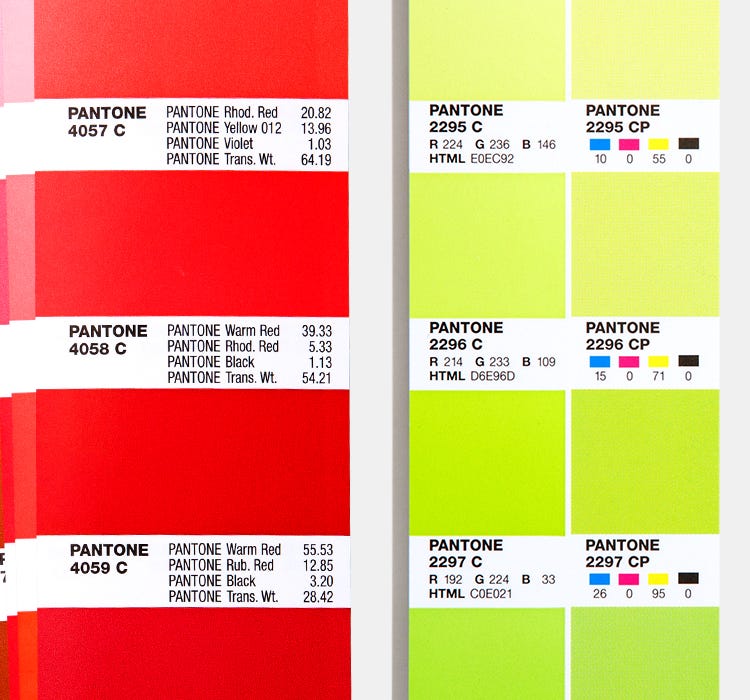
Pantone
Pantone is known worldwide as the standard language for colour communication in the printing world. The “Pantone Matching System” is an international colour system that allows precise assignment of colours using a coding system. The basic colour mixing ratio is mentioned for each shade as well as the type of paper the colours are printed on – uncoated, matt and gloss.
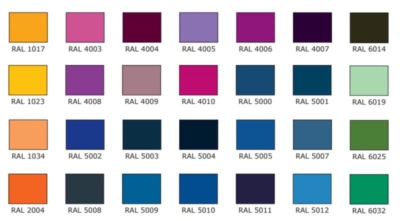
RAL
RAL is the primary colour system used across Europe to coordinate exact colour matches in a variety of projects from interior design to architecture. The RAL colour system defines matte, glossy, and metallic surface colours. The RAL colour system is the system used for the 2-pac spray paint finish that is often used for the finishing of event and exhibition set and decor.
Joining the two together
Matching a Pantone reference to a RAL code is very difficult, so it is always best if the appropriate colour system can be determined and referenced by a client at the design phase.
There are several online convertors that will attempt to offer a colour match between the two systems, but usually, the best result is through sampling on appropriate medias and comparison by eye. If you’re looking to match a Pantone to RAL colour you will find that it’s more difficult than converting from RAL to Pantone. There are 1000+ Pantone colours for only 200+ RAL colours, so there is less choice.
Working from a Pantone for build can be particularly problematic if there are multiple build suppliers working on the same project. It is always recommended to communicate build colours defined by RAL from the outset of any fabrication project.
Maestra is a specialist in Production Fabrication with a dedicated in-house workshop. We have capabilities in Carpentry & Joinery, CNC Machining, Paint Finishing and Metalwork – all in house. Contact the team today to discuss how we can support your next project.